
Don't Start Web Design Until You Know These 2026 Trends
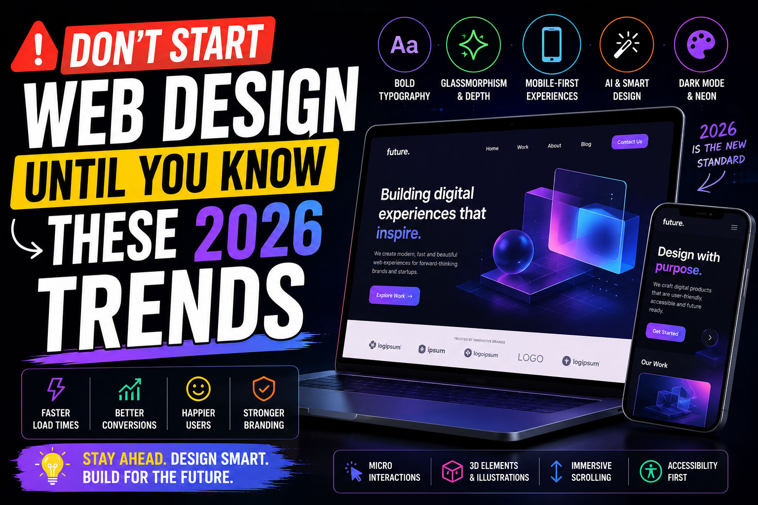
Web design trend roundups tend to blur together: bold typography, glassmorphism, dark mode, AI-generated everything. Some of these genuinely change how people experience a site. Others are visual noise that looks great in a Dribbble shot and actively hurts usability once real users with real patience levels show up. Here's a filtered list.
Trends Worth Adopting
1. Fast, restrained motion
Subtle micro-interactions - a button that responds to a click, a card that eases into view - still make a site feel more polished than one that snaps between states. The key word is restrained. Motion that exists purely to show off, like heavy scroll-jacking or long intro animations, tends to frustrate returning visitors who just want the page to load.
2. Accessible-by-default color and type systems
More teams are baking contrast ratios and readable font sizes into their design system from day one instead of retrofitting accessibility later. This isn't just an ethical win, it also tends to improve conversion, since a site that's easy to read for someone with low vision is usually easier to read for everyone else too.
3. Component-driven, content-first layouts
Design systems built around reusable components (rather than one-off page layouts) make it much easier to keep a site consistent as it grows. Paired with a content-first approach - designing around what the page needs to say, not just how it should look - this produces sites that are easier to maintain and faster to update.
4. Genuine performance as a design constraint
Treating page weight and load time as design requirements, not an afterthought for developers to fix later, has become common among teams that actually look at their analytics. A beautiful layout that takes eight seconds to become interactive loses visitors before they see any of it.
Trends Worth Questioning
1. AI-generated imagery everywhere
AI-generated hero images are cheap and fast, but they're also becoming a visual cliché, and users are getting noticeably better at spotting them. If your brand depends on feeling authentic or handmade, generic AI art can quietly undercut that.
2. Over-animated scroll experiences
Parallax-heavy, scroll-triggered storytelling can be memorable for a portfolio piece, but it's frequently a poor fit for a business site where visitors just want information quickly, especially on mobile where these effects often perform badly.
3. Trend-chasing typography
Oversized, experimental type looks striking in a mockup, but it can tank readability at normal viewing distances and cause real problems for accessibility tools. If a headline needs a second look just to parse the words, that's a cost, not a feature.
How to Decide What's Right for Your Site
Before adopting any trend, ask what it's actually solving. A trend that improves clarity, speed, or accessibility is usually safe to adopt even if it's popular. A trend that exists mainly to look current is worth testing carefully with real users before it goes anywhere near production, since "looks impressive to other designers" and "works well for the people actually using the site" are frequently two different things.
Final Thoughts
The web design trends holding up in 2026 aren't the flashiest ones, they're the ones that quietly make sites faster, clearer, and easier to use. When in doubt, prioritize the visitor over the visual trend, and let performance and usability data settle any argument that opinion alone can't.